Introduction
For starters, I want to make clear the level of knowledge you are expected to possess when viewing this blog post. HTML is by no means a complex coding language (if it can even be called a coding language), but if you have never studied its syntax before, this blog might be a little difficult to understand. Therefore, it is expected that you:
1: know how to link a CSS file to your HTML files using the link element
2: understand basic CSS styling components such as background, color, and have a basic understanding of the CSS Box Model (that is, content, padding, border, margin)
3: last but not least, understand how HTML div’s work in conjunction with classes to create CSS formatting for sections of content in your HTML documents.
What I Will Cover - Content Wrappers
There is a very subtle, yet important, distinction between a content wrapper class and a class used for general CSS Styling. Let’s take a look at my mock website here for an example of a class used solely for styling things visually instead of content centering/margin control.
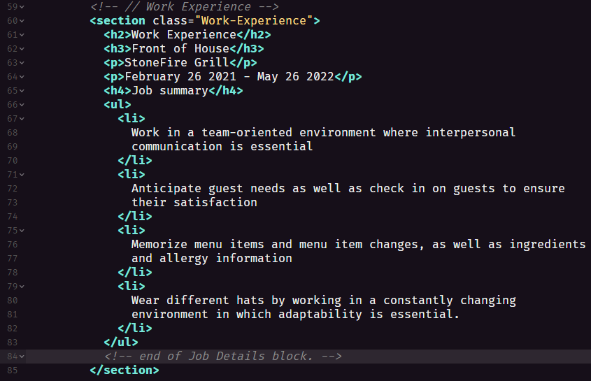
Below is a picture of how my class is being used in the HTML of this website.
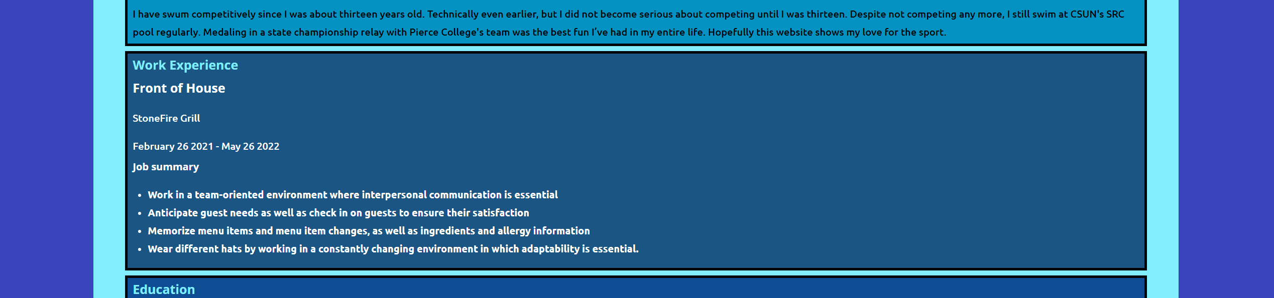
This next image depicts how the website looks after the class “Work-Experience” has been applied to it.
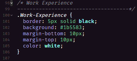
This final image shows the CSS responsible for making these styling changes happen behind the scenes.
See how the content is all left-aligned inside the content box at the moment in the screenshot showcasing the website? That is what our content wrapper seeks to fix. Instead of centering the ENTIRE page, we will use a class labeled “content-wrap” within a div element to selectively center content of our choice in a more organized manner. This content wrapper will be re-usable elsewhere in other sections of my html website, as you will soon see.
Making and Using Content Wrappers
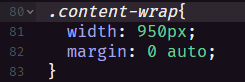
Content wraps are really just ways of divvying (See what I did there? DIV?) up content on your site in (sometimes) reusable classes. That’s it. Here’s what a basic centering content wrapper does, in which the width on both sides of the content is 950 pixels on the left and right, and the margin spacing (remember the CSS box model!) is set to 0 on both sides, and auto simply evenly distributes the top and bottom spacing in an equivalent manner.
All we need to do to apply this spacing rule to specific sections of our website is add a div that wraps the content in our HTML we want to center like so:
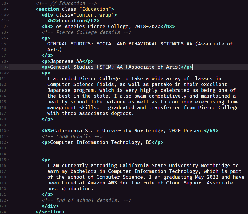
Note how the section class “Education” still applies its CSS color and border styles, while the div content-wrap also centers the content without messing with the color or styling of the “Education” class.
Conclusion & Scope
So, how useful can this technique of nested CSS classes be? Very useful. Imagine you want certain text to be styled with a certain font, but centered at specific areas of long paragraphs, but also contain borders and have background colors for specific sections of a website. The combination of divs and classes makes this possible. You can proverbially slice and dice CSS styles using divs and classes to style only relevant parts of content, thus opening up an unlimited amount of complexity with styling choices. The rest is simply up to your knowledge of CSS styling and how deep you want to go. Happy styling!